When you see a stock chart, there is hardly any chart which moves only in a linear fashion. Usually there will be ups and downs, hence it will be wise to find all this bounce points also known as support and resistance points. Lets see some examples of those lines and what do they mean to investors.
1. Support/Resistance Lines
Support lines comes in 2 main forms
– Uptrend support Line
– Downtrend support Line
Uptrend Support/Resistance Line
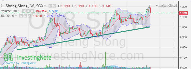
From the screenshot above from investingnote.com, we can see the Green line which guides the upward trajectory of the company’s shares. This uptrend support line indicates the company’s growth and performance over time. This is only accurate insofar as there is stability in the business and the overall economy.
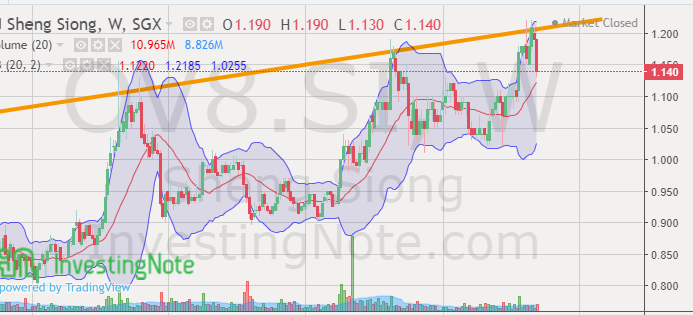
From the screenshot above from investingnote.com, we can see the orange line which guides the upward trajectory of the company’s shares. The uptrend resistance line “limits” the growth in terms of the share prices amidst volatility in the market. This line will be a good gauge of how high would the price rally towards.
2. Moving Averages
Moving Averages are basically lines drawn based on previous days or weeks share prices. This lines are weighted hence the latest share price should gravitate to the moving average unless there are major news or updates about the company or markets causing the large deviation.
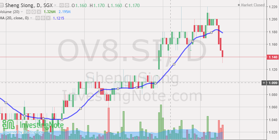
From the screenshot above from investingnote.com, we can see the daily candle sticks hovering around the 20 days moving average (Blue line). Using this instrument you will be able to observe how far is the share price from its moving average. Judging based on past share prices and MA, you can then compare them to have a better idea on when you should buy or sell a share.
I encourage young investors to play around with the charts on Investingnote.com to have first hand understanding of support and resistance lines.
Checkout other posts on technical analysis! It will be a good starting point for young investors